Weight, warmth & shade
Concrete & timber
architecture moodboard.
Concrete does not have to feel cold, and timber does not have to become decoration. This board looks at the space between them: a heavy ceiling above a lighter floor, a dark frame beside a leaf, and furniture that brings the scale back to the body.
- Soft grey
- Warm timber
- Charcoal
- Leaf green
The question behind this board
How can a small amount of timber change the way a concrete room feels?
Let one material lead
Choose whether the room is held together by a continuous grey surface or by a timber lining. A board becomes easier to read when the second material has a specific job, such as marking a threshold or bringing warmth to a place to sit.
Collect a relationship, not a finish
A photograph of a wall is less useful than a view showing how that wall meets a floor, a window and a person. Include both a whole-room view and a close comparison so the palette has a spatial reason to exist.
Reference 01
House in Yoga
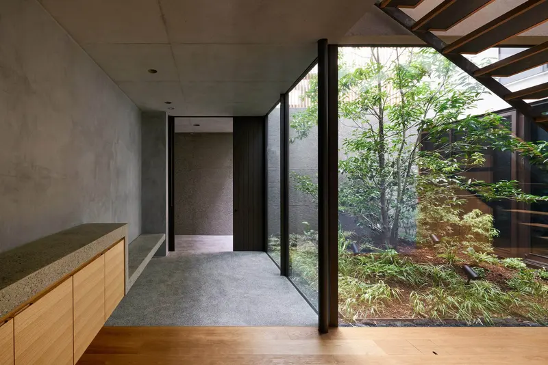
In the courtyard view, pale timber meets a grey floor at the edge of a glazed hall. The planted space is the brightest part of the composition. For this board, the useful idea is restraint: a limited material palette lets the garden supply the colour and movement. Compare the threshold rather than treating every grey surface as the same material.
Explore the project ↗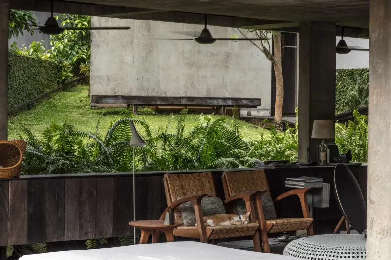
Reference 02
Andra Matin’s Home
Here the emphasis moves toward shade. Concrete columns and a low ceiling frame a garden, while dark timber and woven chairs sit close to the viewer. Compared with House in Yoga, the darker foreground gives the greenery more contrast. The transferable idea is a sheltered edge where the garden feels like part of the room.
Explore the project ↗Try this in your own moodboard
- Save a room-wide view and one threshold detail from each home.
- Write down which surface supplies weight, which brings warmth, and where the light enters.
- Remove any image that repeats the palette without adding a new spatial idea.
Colours are editorial references drawn from the photographs, not sampled paint matches or product specifications.
From inspiration to your own collection
Keep the idea. Make it yours.
Open a project to explore its full gallery. Sign in, save the designs that answer your question, and group them into a collection with your own notes.
Project sources
Selections and comparisons by Arch Moods. Follow the original project accounts for the facts behind the references; photography credits stay with each project gallery.
Sources & evidence
- Keiji Ashizawa Design — House in Yoga
Tokyo; 2019; architects Keiji Ashizawa and Mariko Irie; courtyard, tree and vertical lattice arrangement.
- Dwell — project interview and photograph captions
The kitchen island is identified as Silestone Charcoal Soapstone.
- Cosentino — Charcoal Soapstone product identity
Charcoal Soapstone is a Silestone colour; product options do not establish installed finish or thickness.
- Design Anthology — Andra Matin’s Home